Several months ago, I found Bryan Povlinkski's (really nicely cleaned) dataset with 2013 NFL play-by-play information, based on data released by Brian Burke at Advanced Football Analytics.
I decided to browse QB completion rates based on Pass Location (Left, Middle, Right), Pass Distance (Short or Deep), and Down. I ended up focusing on the 5 quarterbacks with the most passing attempts.
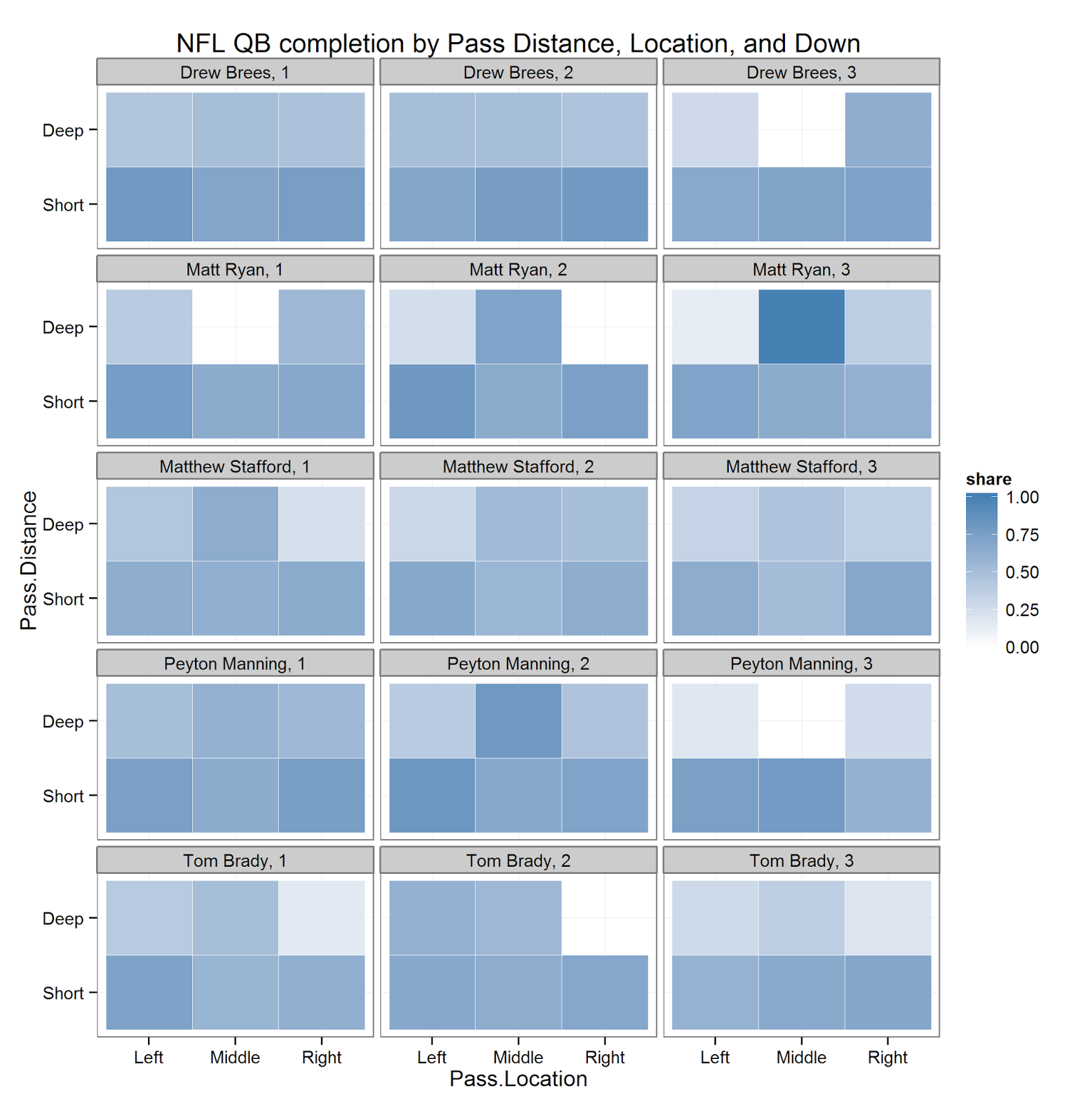
The plot above (based on code below) shows a heatmap based on completion rate. Darker colors correspond to a better completion percentage.
Because we've only got data from one year, even looking at the really high-volume passers means that the data are pretty sparse for some combinations of these variables. It's a little rough, but in these cases, I deced not to plot anything. This plot could definitely be improved by plotting gray areas instead of white.
There are a few patterns here – first, it's iteresting to look at each player's success with Short compared to Deep passes. Every player, as we would expect, has more success with Short rather than Deep passes, but this difference seems especially pronounced for Drew Brees (who seems to have more success with Short passes compared to the other players). Brees seems to have pretty uniform completion rates across the three pass locations at short distance too – most other players have slightly better completion rates to the outside, espeically at short distance.
As we would expect, we can also see a fairly pronounced difference in completion rates for deep throws on 3rd down vs. 1st and 2nd down. The sample size is small, so the estimates aren't very precise, this pattern is definitely there – probably best exemplified by Tom Brady and Peyton Manning's data.
As a next step, it would be interesting to make the same plot with pass attempts rather than completion rates.
library(dplyr)
library(ggplot2)

# note: change path to the dataset
df = read.csv("C:/Users/Mark/Desktop/RInvest/nflpbp/2013 NFL Play-by-Play Data.csv",
              stringsAsFactors = F)

passers = df %>% filter(Play.Type == "Pass") %>% group_by(Passer) %>% summarize(n.obs = length(Play.Type)) %>% arrange(desc(n.obs))
top.passers = head(passers$Passer,5)


df %>% filter(Play.Type == "Pass",
              Passer %in% top.passers) %>%
  mutate(Pass.Distance = factor(Pass.Distance, levels = c("Short","Deep"))) %>%
  group_by(Down,Passer,Pass.Location, Pass.Distance) %>%  summarize(share = (sum(Pass.Result == "Complete") / length(Pass.Result)),
                                                             n.obs = length(Pass.Result)) %>%
  filter(n.obs > 5) %>%
  ggplot(., aes(Pass.Location, Pass.Distance)) + geom_tile(aes(fill = share),
                                                           colour = "white") +
  facet_wrap(Passer ~ Down, ncol = 3) +
  scale_fill_gradient(low = "white", high = "steelblue", limits = c(0,1)) + theme_bw() +
  ggtitle("NFL QB completion by Pass Distance, Location, and Down")
Love it, really cool to see. One thing that jumps out at me is Matty Ice going deep in the middle on 3rd vs Brees and Manning. Would be great if you could incorporate geom_text() and put (like you say) the number of attempts and the actual percentage complete on there (be happy to work with you on it. Would probably have to fudge the co-ords relative to the axis a little.
ReplyDelete